Graphical User Interface #1 - Plot breakdown
This tutorial is the first of a serie dedicated to Graphical User Interface (GUI) creation with SCILAB. If you read this, you are already convinced SCILAB is a powerful tool for any kind of data processing and computer science. What's cool, is that SCILAB also enables you to create application mixing processing algorithms with a GUI. This allows you to automate your work and share your applications with colleagues or clients. But let's be honnest, working on GUI in SCILAB might be frustrating for people who hoped to get something by the end of the day. This serie of tutorials aims at providing you with the mandatory tools to understand how graphics objects are working in SCILAB and start creating complex applications.
Let's start by understanding how graphics are working within SCILAB. Scripts can be find beside.
The automated way
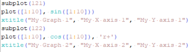
It is pretty easy to quickly create graphics for data visualization. Let's take an example:
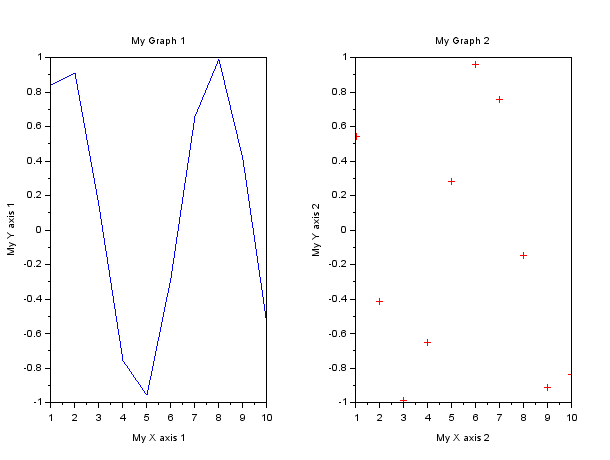
As you can see here, you managed to create "complex" graphics easily. What you might not realize is what it actually takes to set it up. Well, let me tell you:
- Create a figure (with a name)
- With given width and height
- With white background color
- Create two set of axis (with names)
- Specify location of axis
- Specify x and y labels
- Specify titles
- Create axis content
- Specify the axis we want to plot in
- Plot
And, trust me, I went easy on the plot part.
The custom way
Let me unveil what a simple graphic really is deep inside. You can actually try it and explore on your own. To do so, generate the graphic above and keep it open. Then get the current figure with the gcf() function. Here is what you got.
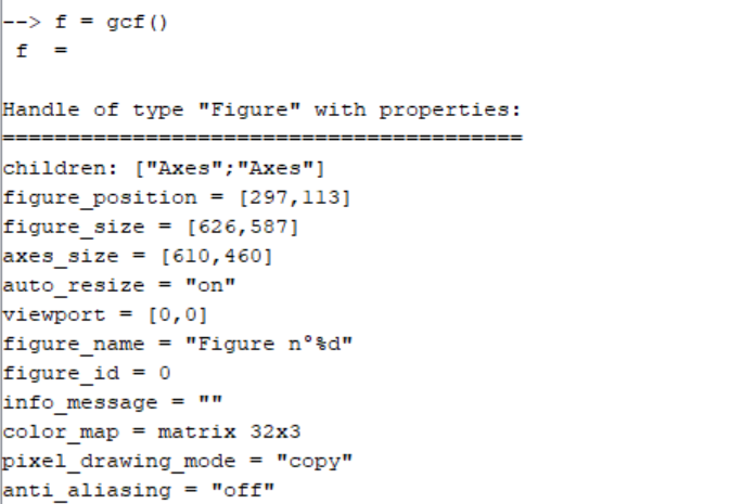
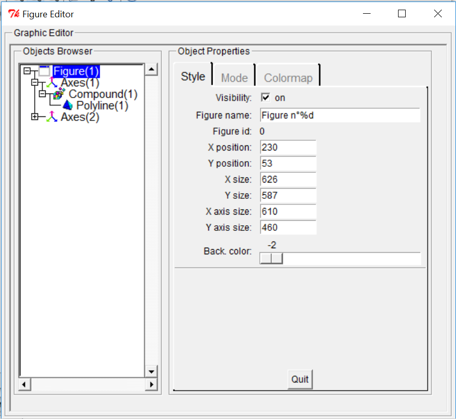
Doing so, you got what we call a handle, with several properties such as figure_size or color_map. That is what we wall a Figure in SCILAB. And this figure is only the ground component of your graphic. As you can see, this "Figure" handle has two childrens. One for each set of axis. Let's grab one of those using the get current axes function gca() or access it via the figure properties.
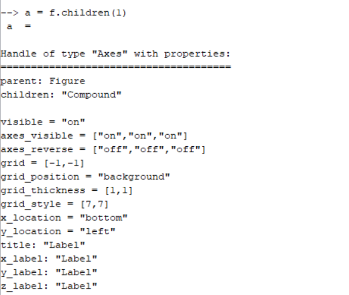
Again, what we got is a handle of type "Axes" with many customizable properties and childrens. Hopefully, there are a limited number of levels (childrens) needed to create such a graphic. That is what we can see in the figure editor below with the fully unfolded tree view.
Now, let's try to set up the exact same graphic we did (the automated way) but this time, building it step by step.
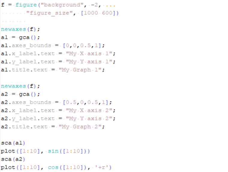
Here you can see the full breakdown I was speaking about earlier in this paper. We first create a figure. We customize it. Then, we create axes. We customize them. And finally, we use the sca() function to specify on which set of axes we would like to set our plot. For more information about the handle customization, you can find Figure properties and Axes properties in dedicated help pages.
At the end, I still use the plot function. "What's the difference?" you may ask. Well, in that case you know exactly where you've set your graphics. And that is very important when you are making your own GUI.
Graphical User Interface organization
What you will discover in the next tutorials of this GUI-serie, is that complex GUI are organized as simple graphics. You will need to define Figure and components such as Axes if you want graphics or Uicontrol if you want buttons/sliders/etc. And those Uicontrol can be customized through properties (Uicontrol properties). Whatever you will be doing, you will have to define the right thing at the right place.